Friday, December 16, 2011

Concept art made real

http://www.portorleans.org/forum/viewtopic.php?f=9&t=535

http://www.portorleans.org/news.php

http://mainstreettravelco.com/blog/?p=95
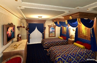
Here are some 3-d concept work for rooms that could possibly be made into disney resorts. The top one is called the "Princess room" which will be in the Port Orleans resort. The bottom art shows a room based on the attraction the Haunted Mansion, this one has yet to get an answer if it is going to be made yet. But the "princess room" has gotten a yes.
http://themeparkmom.com/disney-world-royal-princess-rooms-preview/

http://dizfanatic.com/Dnews.aspx
Now here are some photos taken of the room as you can see some of the details and orginal design has changed, which does happen in most works. But these rooms will be fully open in the early 2012 so it hard to say if they will make more changes to it. But yea as for right now you can see that it looks like they developed more on some areas or the room and lost some details in others. But like I said before this happens alot that the original is not always the same as the final product.

Thursday, December 15, 2011

Concept art for Priates of the Carribbean


Here are a few works for the movie "Pirates of the Caribbean:dead man's chest and at worlds end". These art works are the process of character designs. The top one is a close up shot of Jack Sparrow in his version of the "sea crew" in Worlds end. Most of the crew in the movie were CGI and computer engineers need to see every detail needed to create these characters. As you can see most of the process was drawn on paper, once they got their final piece they began the process of bringing that character to life. Alot of scenes were drawn out as well; for example the bottom picture was drawn for the climax of "At Worlds End." These drawings were either made to portray one scenes or a story board of scenes.

Friday, December 9, 2011

Michelle Farra
Professor Jones
History of graphic design
12/9/11
                                                A look into “Graphic design USA”
While looking at the materials of the magazines “Graphic design USA”, each issue bring something new to the table. The contexts within them show much verity; such as spot lights on different designers, they also hold contest for different design genres and you are able to take a look at their works. This magazines also talks about famous design companies and their works and progresses in the art world. They also bring up some regular new that effect the art world in any way. This magazine is a great way to look for inspiration from other as well as just a fun read, now even with all this does it hold up and keep ones interested, Or does it just end up falling Flat?
 “Graphic design USA” is perfect for students who wish to look at example of the others works, whether they are already designers or student work. These magazines cover many different artists each month so it’s great to see the verity and style of each is work. The contest they hold not only gives someone the opportunity to enter; but it also good to look at other people’s work and be able to maybe learn for them. “Graphic design USA” has more to look at when it comes to the artist that they cover. The art work is also presented in a clean manner, now when it comes to information about different artist they sure know how to do it.  The magazines gives some reports about designer’s works and upcoming projects it also gives a little back ground information of the artist as well.
Now let’s take a look at how the magazines covers design companies as well as the new, when it came to covering news “graphic design USA” has its section for it for each month; each discussing things happening in the art world. Many of the articles are attention getting and the images that come with them make you want to read hem even more, it’s definably something to look in to. Many of the articles can also be either about an artist a designer or news that somehow affects art companies. Moving on to the Design companies and the way that they are mention throughout, just like the news it’s almost a different company every month and a different story as well. Now even though the magazines covers stories about the companies, some are really interesting while others can be a little dull, But then again it depends who is reading them.
So in the end I would recommend this magazine it cover many interesting stories and news, and it also is a great references to look at others art work or to see what the pros are doing out there. It’s also great to see what the popular style is now or what’s upcoming, and when you get to see the art work of students or people that are new to graphic design field. Also the magazine is great for seeing not only the art work’s new but new that surround the art world and how it’s affecting it. So when opening this magazines is always a surprise; but it’s always there for a good read.
                

Wednesday, October 19, 2011

Funny Advertisment

Funny and creative advertisement is a great way to get you audiences attention. Making it funny makes the audience either remember it or talk about it. One way to how this is exaggerating the item in a creative way, for example these three photos do a great job showing that.

Wednesday, October 12, 2011

messages

http://osocio.org/message/cure_the_victims_of_cosmetic_tests/
This ad is to help stop animal testing, the person did a good job to visually give a message about how it kills animals. There are many different kinds of make up that represents blood. This poster gives out a strong message that just catches your eye and gives you many emotions.

http://www.designyourway.net/blog/inspiration/56-fresh-and-intelligent-print-advertisements/

http://www.debacleville.com/cool-ads

Wednesday, October 5, 2011

character expression development

http://www.fanpop.com/spots/disney-princess/images/18028371/title/little-rapunzel-concept-art-photo
http://kaytree.tumblr.com/post/2969075651
I found this image on google which shows the different emotions for the character Rapunzel from the Disney movie "Tangled" these show a little of the process of how the character should look in the final product. Since the movie was a CGI these rough drafts would help animators to move the model the way the creators wanted them to be.

http://www.screened.com/rapunzel/15-5240/all-images/132-2410162/rapunzel005/131-378887/    


Wednesday, September 28, 2011

Logo evolution

I picked a logo that everyone maybe familiar with but here it shows it going trough evolution though out the years, even though there are some difference between the years some area stay the same.


Here e see the evolution of the Starbucks logo over the years,  as you can see it keeps with the style of keeping the same image yet changing it slightly. If you notice the first logo it is much more detail when it comes to the image also it shows more of what it sells. But over the years the logo image has brought down the detail as well as the words, keeping it sort and sweet. As the years continue the image becomes enhanced, and not today the image became more larger and they lost the name all together. This shows that the logo is so recognizable that everyone knows where its from that it no longer needs the name of the store.

Wednesday, September 21, 2011

Epic movie poster

I saw this movie poster while just looking around google, It really catches your eye and it actually took me a second look to realizes that it was ammo that made the picture. I think this was a really creative idea and it really makes you want to look at the poster and go see the movie.